
This footer design was created in response to a user friction point discovered via Mouseflow, a session recording tool. Users were mistaking the global email sign-up as the next step in transactional forms, such as the financing application, due to its placement, button label, and color.
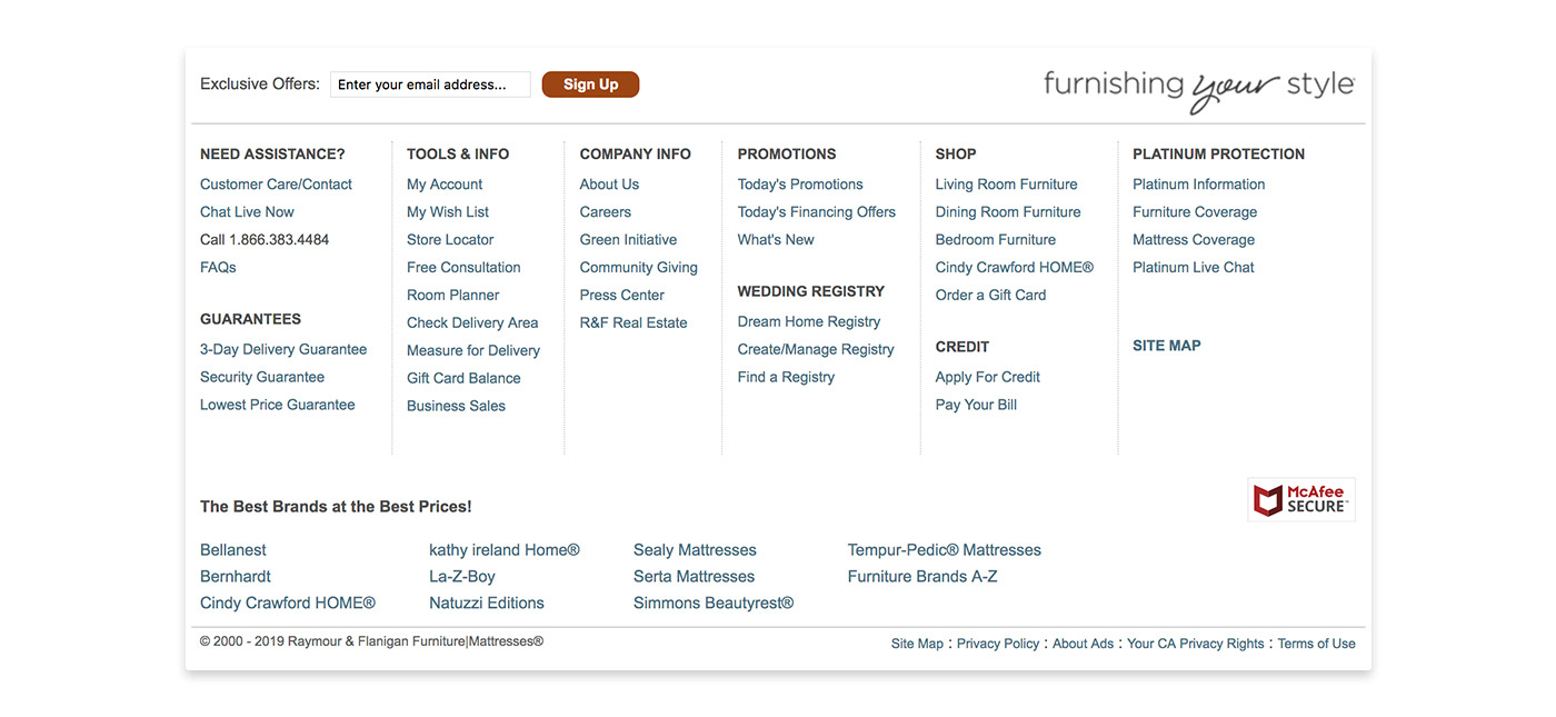
Previous Footer Design
The primary focus of this redesign was to reposition the global email sign up to reduce its prominence, but also presented the opportunity to increase the usability of the footer through a reduction of links. I gathered click engagement data for the footer links via Adobe Activity Map, and proposed a 64% reduction in links based on the collected data. The remaining links held 72% of the overall footer link equity and align with current business goals.
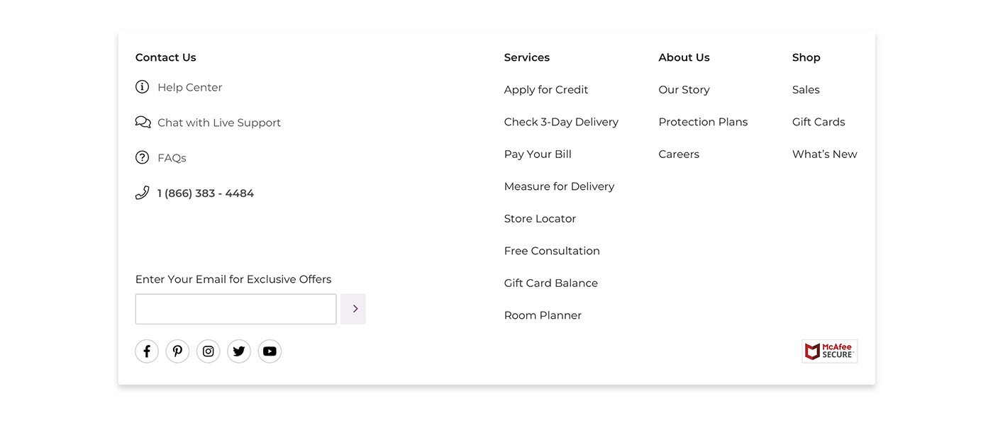
Updated Footer Design
The mobile experience contains a mega-drop solution, with the contact links exposed. The contact links displayed a high volume of engagement with our mobile users, despite the friction of original footer’s accordion solution presented. Exposing the contact links reduces this friction point, and grouping the remaining links into a mega drop reduced the amount of decisions the user has to make in order to see what links are available to them.
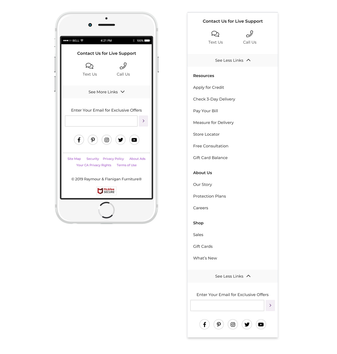
Mobile Footer Experience

